
Soco music project work placement
Introduction
This semester, I had the privilege of undertaking a work placement to develop my key interests and broaden my understanding of creative industries. My focus was on enhancing my skills in graphic design, clothing design, marketing, photography, videography, and advertising. I secured a placement with SoCo Music Project, a Southampton-based music charity, where I aimed to contribute to their brand image and gain a creative outlet to practice and refine my expertise.
Overview and My Role
SoCo Music Project provides invaluable services to diverse communities by using music as a transformative tool. They work with individuals facing addiction, children with disabilities, and emerging artists in need of affordable studio space. Additionally, they host open sessions for anyone to come and enjoy music-making. This diverse engagement inspired me to assist SoCo in raising awareness about their initiatives, focusing on enhancing their brand identity and promoting their new studios. My role also extended to helping musicians associated with SoCo develop their band's marketing strategies and digital content.
During this placement, I collaborated with a fellow designer from my university, striking a balance between shared and individual responsibilities to ensure we both fulfilled our objectives. Together, we meticulously planned our roles, initially concentrating on the branding of SoCo’s new recording studio as a joint effort. This collaboration allowed us to harness our combined strengths, creating a unified and impactful design while fostering mutual growth and creative exchange. Alongside this collaborative project, we pursued independent tasks tailored to our unique interests, each contributing to the broader development of SoCo’s brand identity. This approach ensured that our contributions were both distinct and complementary, allowing us to showcase a robust portfolio of work by the placement's conclusion. By blending collaborative and individual endeavors, we not only elevated the brand’s image but also refined our respective skills in both shared and specialized areas of expertise.
Learning Objectives
I crafted my learning objectives after a productive discussion with the CEO, who offered insight into SoCo’s mission and operations. This helped me align my goals with their needs, allowing me to both contribute meaningfully to the organization and gain real-world experience in my fields of interest.
Learning Objectives:
- Develop the branding and advertising for the new recording studio
- Understand real-world workflows and stages of design briefs.
- Enhance my soft skills in client management and communication to deliver successful outcomes.
- Explore techniques for creating impactful campaigns and building recognizable brands.
- Study strategies to improve brand visibility and competitiveness online.
- Build on existing design skills by applying them to practical tasks.
- Expand expertise in Adobe programs and explore new design software.
- Transition creativity from hand-drawn designs to digital platforms.
- Develop effective personal scheduling methods, to meet deadlines with contingency plans.
- Seek regular feedback on designs to refine skills to industry standards.
- Aim for consistent improvements and readiness for post-university professional demands.
With these learning objectives in mind I intended to utilize this placement to strengthen design, marketing, and organizational abilities, aiming to enhance employability and creative output to a professional standard.
SWOT
Through a comprehensive SWOT analysis, I identified key areas of focus: my existing strengths, areas for improvement, ambitions, and potential threats that could impede my progress. My primary strengths lie in photography and videography, skills I developed during college where I refined my abilities in tools like Photoshop and mastered foundational techniques, such as the rule of thirds, for capturing compelling visuals. Leveraging this foundation, I aimed to deepen my expertise by producing both long-form and short-form content. This approach would allow me to reinforce my existing knowledge while exploring new techniques, particularly in videography—a field I had limited experience with during my college studies but was eager to excel in. Another strength is my communication ability, supported by strong social skills. While I am adept at engaging with others, I sought to refine these skills for a professional context, transitioning from a personable demeanor to a credible professional who demonstrates expertise. Additionally, I have a talent for freehand sketching, which has been instrumental in generating graphic concepts and preliminary ideas. However, I recognize a gap in my ability to translate these skills into digital formats, an area I intend to improve upon.
In terms of weaknesses, I identified several critical areas for development. First, I aimed to elevate my existing skills to industry-standard levels. Time management and organizational skills are particular weaknesses, as I often fail to label and organize tasks efficiently, leading to last-minute stress and diminished quality in my output. This tendency also increases the risk of burnout. Moreover, while I am a quick learner, my software proficiency is limited to a narrow range of tools, and I lack versatility in working with various programs. Lastly, I discovered that I lacked a clear specialization, possessing only foundational knowledge across several domains without a focused area of expertise to pursue as a career path.
During my placement, my objectives were to address these weaknesses, refine my current skills, and work toward developing a specialization that would guide my post-university career. The threats I identified included the possibility of losing track of time due to my organizational challenges, unexpected circumstances that could derail progress, and the potential difficulty of securing collaborations with bands or clients in need of videography services. This latter challenge could limit my opportunities to build a portfolio and expand my practical knowledge. By systematically addressing these elements, I aimed to improve both my technical and soft skills while positioning myself for a more defined and sustainable career path.
Time Management
To address my challenges with time management, I implemented a structured yet adaptable approach using a Google Sheets document to track my weekly activities. This tool allowed me to record when, how long, and what tasks I was working on each week. I structured my schedule around a fixed commitment to work every Wednesday to align with my university timetable, which included lectures on Mondays, Tuesdays, and Thursdays. This left Fridays and weekends as additional time to catch up on tasks and manage my workload from the week. In earlier projects, I had experimented with Gantt charts to plan my workflow and avoid last-minute task bundling. However, I found that Gantt charts, while valuable for outlining a project timeline, did not accommodate unforeseen changes or disruptions effectively. They often restricted my flexibility, making it challenging to adapt to unexpected issues without compromising the entire schedule. This experience highlighted the need for a more dynamic and responsive system, one that allowed me to track progress without feeling constrained.
To create a more flexible plan, I shifted my focus to knowing what tasks needed to be done and tracking what had already been completed. I integrated the Pomodoro Technique (see Figure 1) into my workflow, a time management strategy emphasizing focused work intervals of 25 minutes followed by short breaks. For every hour of work, I would take a 10-minute break to reset—changing my environment, going for a walk, listening to music, or enjoying a snack. This approach proved instrumental in maintaining my concentration and avoiding burnout, ultimately enabling me to complete my tasks effectively, even when my initial time schedule did not unfold as planned. In addition to employing the Pomodoro Technique, I organized my tasks by listing objectives and categorizing them using a color-coded system tailored to my visual learning preferences.
While this system helped me visualize my workload and priorities, it also exposed some shortcomings in my initial planning. I occasionally underestimated the time required for specific tasks, leading to a cascading effect where short tasks evolved into more complex, time-consuming endeavors. This resulted in the extension of originally brief tasks into full-day commitments, as evidenced in my documentation. Over time, the originally diverse range of color-coded tasks began to shift toward longer durations, reducing my available time for subsequent activities. This miscalculation led to occasional rollover of tasks into subsequent days to ensure completion, ultimately compressing my time for future work. Despite these challenges, the combination of a flexible tracking system and the Pomodoro Technique enabled me to address and adapt to these inefficiencies, ensuring that I met my deadlines while improving my overall time management practices.

Project 1 -
Promotional Poster and Example Work


At SoCo, my first project involved creating a series of promotional materials designed to attract bands and artists seeking marketing support for brand development, unique selling propositions (USP), and advertising. My work included a variety of posters and example graphics that showcased the skills of myself and my fellow designer, encouraging clients to approach us for help with defining their brand image or building on existing creative foundations. To illustrate my capabilities, I designed three album covers for fictional bands, each tailored to a distinct music genre, demonstrating my ability to create visuals that resonate with specific audiences and musical themes:
"Postured" - This cover represented the fusion of Phonk, Digital Electronic, and Trap music. These genres are characterized by heavy bass, dark themes, distorted vocals, and synthesizer use, often aligning with rebellious and free-spirited cultural elements. I incorporated a gritty, street-style font inspired by the Chicano graffiti art movement, which originated as a form of resistance and identity assertion among marginalized youth. Drawing from the movement’s Old English typeface, I used a similarly bold font to capture the rebellious energy of Phonk and Trap. I also integrated imagery related to car culture and anime, using my photography and free online assets, reflecting the visual language common in Phonk music edits seen on platforms like TikTok.
"Flamed" - A more introspective take on rap and hip-hop, this album cover emphasized themes of community and activism, often prevalent in the genre. The central image, a photograph I took of friends gathered around a fire, symbolized unity and belonging. The burnt-style parental advisory label complemented the album’s title, “Flamed,” while subtly nodding to the genre’s candid approach to themes like struggle and resilience. This design showcased my attention to the lyrical and thematic depth of music genres, ensuring the visuals felt connected to the music's essence.
"Broken Memories" - Designed for pop and indie music, this cover conveyed a softer, nostalgic aesthetic. Using pastel colors and warm filters, I evoked a light, emotional tone. The focal image—two friends in a heartfelt moment at sunset—captured genuine emotion and camaraderie. To enhance the indie vibe, I added a cracked vignette filter, creating a handmade, individualistic feel. This design demonstrated my ability to adapt to lighter, more whimsical music styles while maintaining artistic depth.

I brought together all the album covers, along with those created by the other designer, into three iterations of a promotional poster. My fellow designer contributed two 8-bit style characters resembling ourselves, which we included on the poster to help bands recognize and connect with us in person. I also incorporated our contact information and a brief description of our services to clearly communicate what we could provide. After refining the designs, I finalized a simplified version with the tagline: “In need of creative marketing for your music?”. This version included an invitation for donations, emphasizing that our services were free while subtly encouraging support. The streamlined design ensured the message was quick to read, clear, and visually engaging, perfect for catching the attention of people passing by.


Logo Sketches
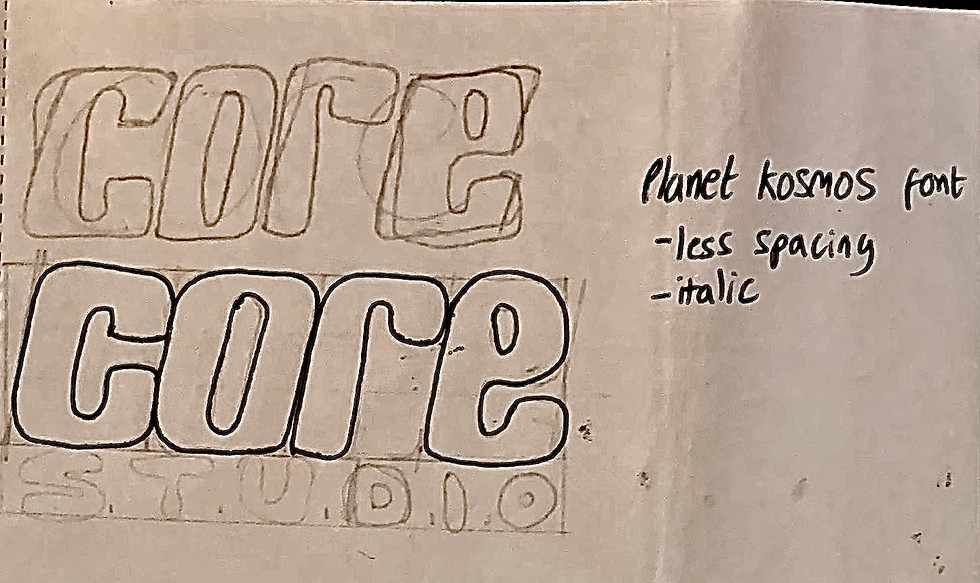
My first major project at SoCo involved developing the branding and marketing for their new recording studio. To ensure a balanced workload, I collaborated with the other designer, beginning with a discussion about our strengths and contributions for the project. We agreed to start by brainstorming names and logos before addressing future content. After consulting with staff, we learned the studio needed distinct branding to promote it as a separate yet connected entity to SoCo, aligning with their approach of unique names for each service. Given SoCo’s ongoing “Planet Sounds” initiative, we opted for a space-themed concept while emphasizing the studio’s role as the core hub for recordings and podcasts.
I proposed several names but 3 stood out: Pulsar, Core, and Cosmos. These integrated the space theme with the studio's importance. Drawing inspiration from Y2K-era typefaces, which resonate with younger artists entering the music scene, I designed futuristic logo concepts to reflect both nostalgia and innovation. However shortly after these designs, I transitioned my focus toward creating photographic and video graphic content, aligning with my interests and placement goals. This included producing an introductory video showcasing SoCo’s premises and services as well as the new studio. The remaining studio branding responsibilities were handed over to my collaborator, ensuring an equitable distribution of tasks.


Project 3 - Pegasuses Filming and Photography
My primary task at SoCo was creating video, graphic, and photographic content for the band "Pegasuses". Together with a fellow design intern from Southampton University and a staff member, we coordinated a date to meet the band and record their newest songs, reworked older tracks, and future releases to produce short live music videos.
Pegasuses requested that the videos be simple and straightforward, so we decided to film them in the recording studio, capturing different angles to keep the videos engaging while maintaining a personal touch. To set the right tone, we arranged the studio with a couch in the background and surrounding LED lights to create a warm, cozy, yet modern atmosphere. Although the band didn’t have a strong preference for the color of the lights, I chose purple, as the room’s natural lighting was quite dim, and the main lights had a warm yellow hue. The purple added contrast without disrupting the calm, inviting vibe of the space.
For each song, I set up one camera to remain stationary, focusing on the two singers placed centrally, following the rule of thirds for balanced composition and another camera for dynamic shots. Originally, I had hoped to use a gimbal for the dynamic shots, but it proved more complicated than anticipated. I needed to email a staff member for training, submit a risk assessment, and wait for approval before I could even rent the equipment. Fortunately, SoCo had a camera with built-in image stabilization, so despite some slight shakiness in the footage, it reduced the instability significantly. By stabilizing the camera with a steady arm too, I captured a collection of effective shots, though some footage was archived due to some shaking at parts. Despite this, the archived shots still provided valuable content, allowing Pegasuses to have a diverse range of material without requiring multiple takes on separate days.
One technique I used was tracking shots to capture multiple angles of the stationary subjects. These shots were designed to heighten emotional engagement, as the shifting perspective encouraged the audience to connect more deeply with the band’s stillness, while also allowing me to capture details missed by static shots. In several clips, I zoomed in on the band members’ faces to deepen the emotional connection with the audience and make the video feel more intimate. I concluded some shots with these close-ups to focus entirely on the singers, ensuring all attention was on their expressions with no distractions.
In addition to recording in landscape for the majority of the songs, I suggested filming in portrait format for social media. This ensured we had platform-specific content, as cropping a landscape video to portrait often cuts out important details. I applied similar filming techniques in both formats, maintaining a variety of angles for both types of footage. I also captured additional footage and photographs for promotional material in anticipation of the song’s release. One notable shot was a close-up of the guitar solo, highlighting the lead guitarist during a key moment in the song. For a more candid touch, I took some behind-the-scenes photos during filming too. Lastly, the other design intern from Southampton planned an interview with Pegasuses, so we set up two static camera angles, one facing the subjects directly and the other at a diagonal. The band members were instructed to look towards the interviewer, ensuring they stayed in frame throughout the conversation.
With this content, I edited one long form video and created promotional material for both that video and the Christmas release which the other designer was working on editing the long form content for. For the other songs, I did not proceed to edit as the songs were yet to be released and I was asked to keep the footage raw as releasing the footage on my portfolio would disrupt their future plans to keep it secret. To help towards this and to develop my own organisational skills, I named all the content accordingly with what song it was and what camera angle was used to shorten the process of finding each video and matching them together. This was highly beneficial as it cut down the time to process and edit the videos due to it being easier to find all the content.
During the editing phase, I worked on two versions of the song "My Friend the Moon". One version was a long-form edit with visual effects and text, while the other was a simpler cut, just with the clips spliced together. For the visual effects, I aimed for subtlety, not wanting to distract from the performance. I lowered the opacity of the effects to keep them in the background. Since the song revolves around communicating with the moon, I used space and nature-inspired effects, such as moving stars, snow, rain, and lens flares, to enhance the atmosphere while keeping it relevant to the song's theme.


During the editing phase, I worked on two versions of the song "My Friend the Moon". One version was a long-form edit with visual effects and text, while the other was a simpler cut, just with the clips spliced together. For the visual effects, I aimed for subtlety, not wanting to distract from the performance. I lowered the opacity of the effects to keep them in the background. Since the song revolves around communicating with the moon, I used space and nature-inspired effects, such as moving stars, snow, rain, and lens flares, to enhance the atmosphere while keeping it relevant to the song's theme.
For the short-form videos, I incorporated more striking visual effects to capture the viewer’s attention and prevent them from scrolling past. I also added transitions to create smoother entrances and exits between shots. One of the short clips was a collage of torn photos layered on top of each other. To achieve this, I captured still frames every few seconds, giving the video a more organic, yet fluid feel. The ripped photos had a nostalgic, personal touch, resembling memories in a photo album, which aligned well with the band’s indie and acoustic style.


For the photographic content, including the interview thumbnail, I ensured the band’s logo was featured in each image, using their brand colors and handwritten-style fonts to reinforce their visual identity. One of the photos I edited was a "coming soon" shot, featuring the microphone, the guitarist's guitar, and the couch, symbolizing that everything was set and the audience was just waiting for the band to perform. Another photo edit depicted the band members with their instruments, framed by their logo, capturing both who they are and what they play.
This project reignited my passion for photography and videography as I experimented with various techniques and angles that I hadn't explored in a while. Despite a few challenges along the way, I consider it a success. In hindsight, I wish I had more time with the band to better plan the direction of the project and clarify roles between me and the other creatives. There were a few moments where the band preferred the music video without the visual effects and text, and having clearer expectations from the start would have saved me time and effort, even though it would have given me more to showcase in my portfolio.
Project 4 - Tour Video
My next major project was contributing to the branding of SoCo's new recording studio by creating an introductory video. This video aimed to highlight SoCo’s offerings while showcasing the newly opened recording space. By this point, my risk assessment and training for using a gimbal had been completed, allowing me to capture smooth and professional shots. The gimbal was especially useful for filming the premises, as it enabled fluid, stable movements while walking, which was more dynamic than the stationary filming I had done for Pegasuses.
SoCo’s spaces varied significantly in size, layout, and equipment, but one unifying feature across the practice rooms was a drum kit positioned at the back center of each room. I leveraged this to plan a match cut transition, a film editing technique that connects two scenes by aligning similar visual elements [see figure 2]. In this case, I zoomed into the darkness of each drum kit, fading the video to black before transitioning seamlessly into the next drum kit in a new room. This approach created a quick, smooth, and visually engaging way to link the spaces.In addition to the practice rooms, I filmed other distinct spaces, including the lounge, DJ booth, and the new recording studio, as these didn’t feature drum kits and deserved to be showcased as separate entities from the standard practice spaces. Beyond my own footage, I was given access to clips of youth and group sessions, which I integrated to showcase the full range of services SoCo offers. During the editing phase, I focused on keeping the video dynamic and fast-paced by incorporating engaging transitions and occasional subtle video effects to maintain viewer attention. For on-screen text, I chose a white font with a slight purple stroke, ensuring visibility against any background while subtly referencing recurring colors in the building’s interior. Since SoCo lacks a defined brand color, this choice added consistency without overshadowing the visuals. To convey SoCo’s services and unique appeal, I used short, impactful phrases that were easy to read and aligned with the video’s tone. For background music, I selected a calm, royalty-free soundtrack that added atmosphere without overwhelming the visuals, ensuring the video remained engaging and professional.
This project was my most successful as it provided the most creative control and allowed me to plan and execute the concept independently. This freedom enabled me to experiment with a variety of techniques, such as match cutting and exploring new transition effects. In hindsight, however, I would have liked access to a more diverse range of content for the video. The group and youth session clips provided to me covered only a few of SoCo’s events, and the repeated appearances of the same individuals could unintentionally give the impression of a less popular or diverse community. Greater variety in footage could have presented a fuller picture of SoCo’s vibrant environment. Overall, this project was a significant success. It not only allowed me to refine my skills in film and photography but also gave me the chance to experiment with tools and techniques, further igniting my passion for visual storytelling.

Project 5 - Album Covers
My final project for SoCo was to create mock-up album cover designs for their end-of-year album. The album featured a selection of artists associated with SoCo, and the design brief emphasized capturing the essence of Southampton’s music scene while reflecting emerging talent and diversity. The covers needed to be bold, youthful, and eye-catching to appeal to the target audience. With these goals in mind, I designed four distinct covers, each representing a unique concept.
My first design was intentionally simple and striking, using bold red as the primary color. Its minimalist approach ensured versatility, allowing it to complement all musical styles. The boldness of the red not only helped make the album visually passionate but also kept in theme with previous covers from other years.
For my next design, I used a photograph I took in the studio of a shaky microphone, symbolizing movement and creative direction. I incorporated purple tones, a recurring color within the studio, and added a neon aesthetic to cater to the younger target demographic of 18-35-year-olds. To emphasize individuality and authenticity, I applied a noise-film effect, giving the cover a unique texture and contemporary feel.
Given the album’s release timing near Christmas, my next design adopted a subtle holiday theme to resonate with the audience’s festive mood. However, I avoided explicit Christmas imagery to prevent any assumptions about the album’s content being solely holiday music. While this design is my least favorite due to its lack of distinctiveness compared to the others, I still believe it successfully aligns with the brief, offering SoCo a seasonal option if desired.
My final cover featured a candid photo I took just outside SoCo Studios. The image captures the spirit of Southampton’s community, with the focus on a busy worker commuting, reflecting the everyday lives of the city’s residents. This design creates a strong connection to Southampton’s local identity, making it relatable and authentic.
All four designs adhered to the brief and brought their own unique perspectives, giving SoCo a diverse range of options to choose from. This project allowed me to balance creativity with client needs, ensuring that each cover offered something distinctive while remaining true to SoCo’s vision.
In addition to the five projects I completed at SoCo, I organized and archived all the raw files and extra content into a shared folder accessible to my placement supervisors and collaborators. In total I had recorded 102 short and long form videos from multiple angles, photographic content of the band and the room as well as extra content including bloopers and mistakes that still had some parts that were usable. This folder contains high-quality photos and videos of the premises, including many that were not used in the final projects. By preserving this content, SoCo can access a valuable resource for future branding or marketing efforts without needing to hire someone new, potentially saving both time and money. This archive ensures that even unused footage, which is still of great quality, doesn't go to waste and remains available for future use. Ultimately, this approach supports SoCo’s long-term marketing efforts and offers a cost-effective solution for producing additional promotional materials.


SDG 12
To align my placement with the UN Sustainable Development Goals (SDGs), I focused on SDG 12, which promotes sustainable consumption and production [see figure 3]. I incorporated these principles into my daily practices, ensuring my actions supported sustainability in both work and life. I reduced travel emissions by commuting via train instead of driving and working remotely when possible, cutting costs and lowering my carbon footprint. This approach demonstrated environmental and financial sustainability. For equipment, I selected energy-efficient LED lighting, which is recyclable, free of hazardous materials, and emits minimal UV radiation [see figure 4] . My camera and gimbal were powered by rechargeable batteries, reducing waste and the environmental impact of single-use alternatives. To minimize paper usage, I conducted most of my work digitally, using sketches only during the planning phase. Content was shared via Google Drive, improving efficiency and eliminating physical waste. Additionally, I applied circular economy principles [figure 5] by repurposing unused footage for future projects, reducing the need for additional photoshoots and conserving resources. These sustainable practices not only supported SDG 12 but also highlighted the feasibility of integrating sustainability into media production. By making intentional, responsible choices, I contributed to a more sustainable approach in my field and set a positive example for others.
Challenges I Faced
During my placement, one of the key challenges I faced was communication, particularly between the university and my placement at SoCo. The CEO of SoCo, due to their busy schedule, had limited time to discuss my progress, provide feedback, or outline the next steps for my work. This lack of direct communication made it difficult for me to gauge how I was performing and how to improve. However, after several weeks, I had the opportunity to meet with Rachel, the administrator, who proved to be an invaluable resource. She helped both me and my fellow designer clarify our goals and find additional projects beyond the branding of the new studio. Through Rachel, I was able to establish contact with Pegasuses, who regularly used SoCo’s premises, which led to new opportunities and collaborations. Additionally, Rachel provided consistent and detailed feedback on my work each week, which significantly helped me stay on track and improve my output.
Despite these improvements, a challenge arose about a month into my placement. I discovered that second-year students were also completing “client projects” for SoCo. This caught me off guard, as I had not been made aware of their involvement and felt their work was overlapping with mine. The second-year students seemed to have clearer objectives and more opportunities at SoCo, without the initial hurdles I faced in getting to know the team, understanding the specific needs, and covering my own travel expenses. This discrepancy led me to feel undervalued, as I had invested considerable effort into identifying projects and aligning them with the needs of SoCo, only to see work seemingly being handed out to others without clarity or coordination. In response to these concerns, I communicated with Rachel, who was unaware of the second-year students’ involvement with SoCo. This led to a period of confusion, as I tried to understand the scope of their work and how it related to my own tasks. I wanted to ensure that I wasn’t duplicating efforts or stepping on anyone’s toes. Unfortunately, this lack of clarity resulted in a few weeks of uncertainty, during which I focused on my other university modules to avoid challenges in the future with them and give me more time to do placement work . I later learned that the work done by the second-year students did not contribute to any substantial projects at SoCo, which further confused me, as it seemed unclear why their efforts were undertaken if they weren’t going to be used.
This situation, coupled with the miscommunication, led to delays in my own work. I found myself scrambling to catch up on tasks that were pushed to the backburner, resulting in a backlog of projects that had to be completed later in my placement. In hindsight, had I continued my work as originally planned and maintained clearer communication with both SoCo and the university, I could have avoided many of the time management challenges I faced. This experience has taught me the importance of ensuring that all parties involved in a project have a clear understanding of roles, objectives, and workflows. In the future, I will make sure to establish clear lines of communication early on and ensure that everyone is aligned on expectations and responsibilities. This will help me manage my workload more effectively, avoid unnecessary confusion, and ensure that my time and efforts are directed toward meaningful, productive outcomes.
Feedback
The final feedback I received from SoCo:
George responded to quite a broad brief by focussing on what we needed most as an organisation. He was proactive, feeding back his work each week with knowledgeable explanations, and was responsive to feedback. He showed initiative when visiting our rehearsal space and studios in order to create video content for us, and was a valuable team member during our Music Industry Office's content creation day with the band Pegasuses, which resulted in a collection of images and videos with a consistent brand identity that we can pass onto the band. Footage for SoCo Music Project specifically will need some more development before we use it in order to bring it in line with SoCo's tone and brand identity, but George's creative ability and innovation is evident, and we will refer to the designs going forward. It's been a pleasure working with George and we hope our paths will cross again in future.
Reflection and Conclusion
In conclusion, my placement at SoCo was a rewarding and transformative experience. Over the course of the projects I undertook, I was able to apply and expand my skills in videography, photography, design, and branding while working in a professional and creative environment. Each project presented unique challenges that pushed me to think critically, refine my techniques, and explore new tools and approaches. I gained valuable hands-on experience and contributed meaningfully to SoCo’s mission. Beyond the technical skills, this placement taught me the importance of collaboration, adaptability, and effective communication, as I worked closely with a diverse range of people. It also reignited my passion for film and photography, as I discovered new methods to express ideas visually. To improve from this placement I would like to continue to grow my organisational and time planning skills as that still remains my biggest challenge. My target was to reach 80 hours of placement work however I ended with only reaching 73, although this isn’t a huge distance, if I had created a contingency plan or found a better way to manage my time then I would have been able to avoid this. Reflecting on this experience, I am proud of the work I produced and the professional growth I achieved. This placement has solidified my interest in pursuing a more hands on career in creative media and provided me with a strong foundation of practical knowledge and experience to build upon in the future. I am grateful for the opportunity to contribute to SoCo’s creative endeavors and for the trust and support they provided throughout my time there.
Bibliography and Reference List
References:
[1] Nancholas, Ben. “The Power of Effective Time Management.” University of Lincoln, 14 Sept. 2023, online.lincoln.ac.uk/the-power-of-effective-time-management/.
[2] Dunham, Brent. “Best Match Cuts in Cinema: How to Plan and Shoot the PERFECT Match Cut.” StudioBinder, 11 Feb. 2019, www.studiobinder.com/blog/match-cuts-creative-transitions-examples/.
[3] United Nations. “Goal 12 | Ensure Sustainable Consumption and Production Patterns.” United Nations, 2024, sdgs.un.org/goals/goal12.
[4] Bagga, Leon. “LED vs. Halogen: What’s the Difference?” Vision Lighting Ltd, 29 Feb. 2024, www.vision-lighting.co.uk/Blog/LED-vs-Halogen-Whats-the-Difference.
[5] European Parliament. “Circular Economy: Definition, Importance and Benefits.” Www.europarl.europa.eu, European Parliament, 24 May 2023, www.europarl.europa.eu/topics/en/article/20151201STO05603/circular-economy-definition-importance-and-benefits.
Bibliography:
Bojórquez, Chaz. “Art in the Streets.” Artinthestreets.org, Art in the Streets, 2022, artinthestreets.org/text/cholo-graffiti.
Ketz, Saskia. “5 Y2K Fonts That Scream Early 2000s Aesthetic.” Mojomox, 21 Mar. 2023, fonts.mojomox.com/en-gb/blogs/on-type/y2k-fonts.